BRIEF
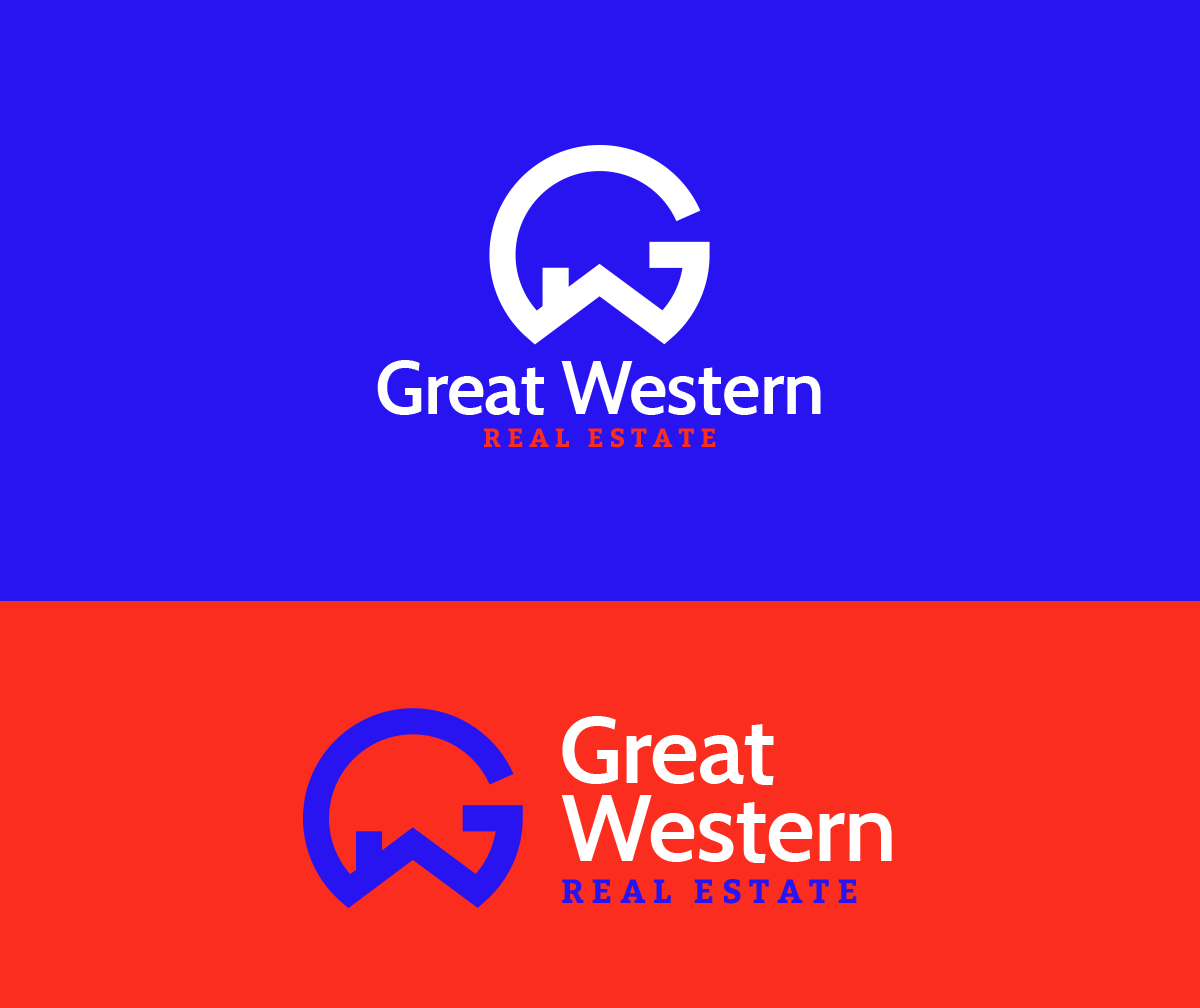
Create a fresh identity for a 15 year old real estate company. Make the brand brighter, simpler and more contemporary. Create a modern version of its original “GW” monogram.
WORK
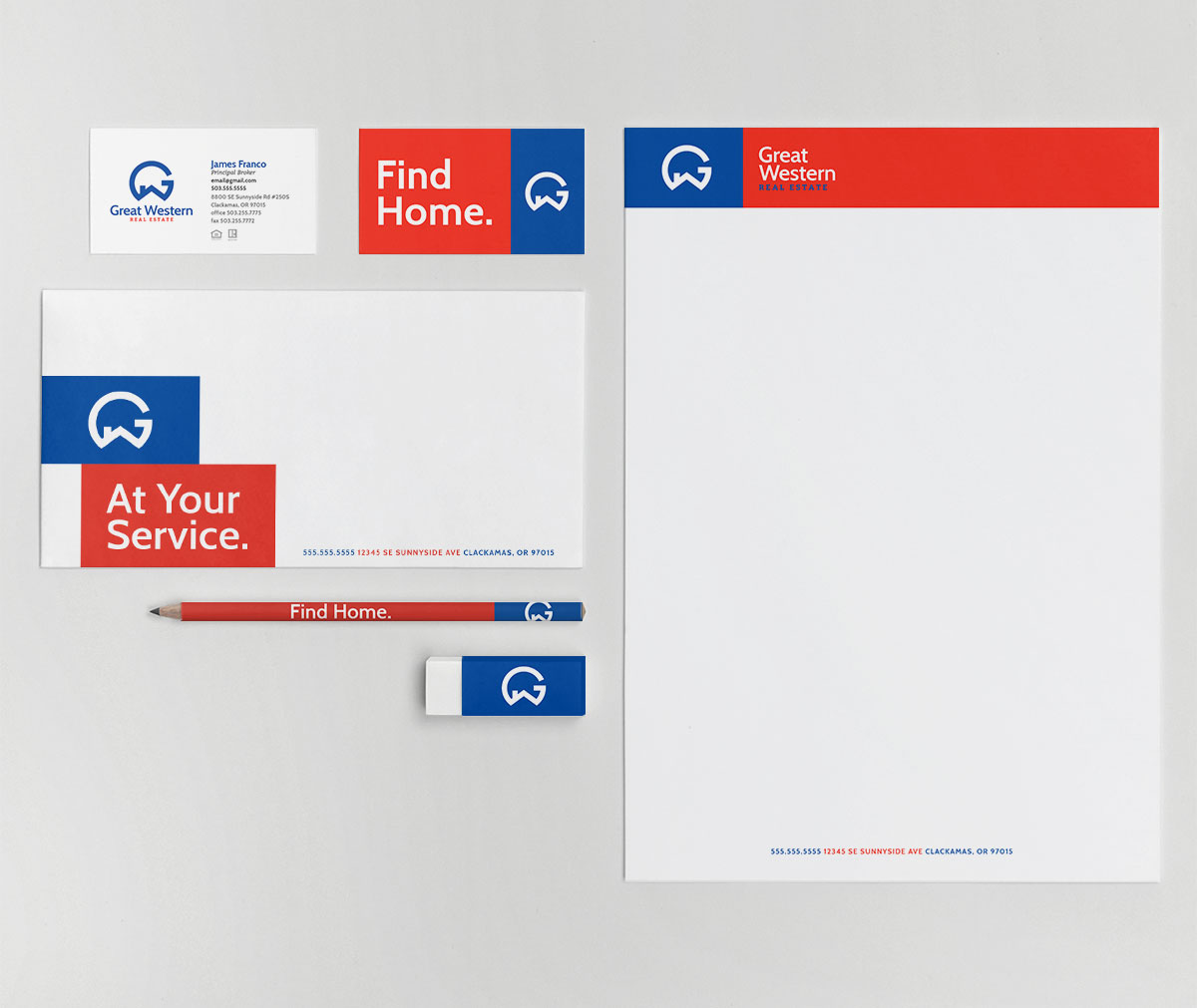
Brightened up the blue and red colors to add vibrance to the brand. Developed a simple, but memorable mark that incorporated the G, W, and a roof top. Replaced the more traditional-looking serif font style with a sans serif giving it a more modern feel. Used a block design system to highlight key brand messages and provide a visual structure for content on marketing materials.
art direction / identity design